How To Make A Writing Portfolio
By Katie Gatens and Nicholas Holmes
Writing Portfolio Guide
Writing Portfolio success... In six easy steps
After eight years in the portfolio business, we've noticed something:
Most writers HATE shouting about their work and their achievements online.
But they shouldn't.
A writing portfolio is the best way to professionally show off your skills and achievements, without sounding braggy or arrogant.
And with a little bit of planning, creating one needn't be a time-consuming nightmare.

In this guide, we'll take you through the six steps required to build a killer profile online, so you can easily have one completed for yourself in an hour or two.
This is the process we'll follow to create your perfect online writing portfolio:
- Objectives: Be clear about them from the start. The work you choose to get a job is going to be very different from the work you choose to land a travel writing gig.
- Hosting: Keep it memorable and professional. If you need to create your portfolio quickly, choose a hosted service such as Clippings.me.
- Portfolio Design: Keep it simple and clean. Avoid distractions but make sure it works on mobile.
- Samples: Add between 10 and 20 pieces of work. Use links or PDF uploads for maximum viewability and to give a snapshot of what you can do, but organize things logically and don't make the user scroll.
- Biography: Showcase your achievements. Make it as long or as short as you want and add a resume if you're job hunting, but make sure you're clear on what you can offer a potential employer/commissioner.
Ready to read more? Scroll on!
Step 1
Objectives

You want to make sure your writing portfolio achieves its objectives - if you're an author, that may be to get you a book deal. If you're a student, it's likely academic consideration and if you're a freelance journalist, it could be to get you an article commission.
So think hard and be specific about what your portfolio should tell the people that come across it. Doing so will make drafting your copy and planning out the different sections MUCH easier.
Common Objectives
-
To get a job - you'll be sending your portfolio to prospective employers or clients, so your main aim is to impress in the field you work in.
-
To sell - you've written some great stuff, and now you want to sell it to an agent, publisher or commissioner.
-
To be more visible - you want a place where people can find you online and learn more about what you do.
Once you know what the aim is, write that down somewhere. As you build your portfolio, every time you write a sentence or add a piece of work, ask yourself "does this addition help my objective?"
If the answer if no, don't add it.
Step 2
Portfolio Hosting

The days of the hard portfolio are DEFINITELY over.
For 99% of portfolio users, digital is the right way to go, as the late Steve Buttry explained in this excellent blog. Steve passed away in February 2017, but his superb blog remains online as a resource for journalism students and professionals and is well worth a read.
We're way past the days of deciding which half-dozen hard-copy clips to stuff into an envelope with your résumé. Unless an employer specifically asks for a hard-copy application, you should apply by email with a hyperlinked résumé. Even if the employer asks for hard-copy (and if you want to work for someone who needs hard copy), you need a URL (or a few) at the top, guiding your future boss to a place to study your work at length.
There are tons of options for creating portfolios out there - Clippings.me is one of them, but you can also create your own using a tool like Wordpress, Wix or Weebly.
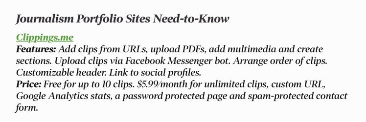
In this piece, Poynter's Kristen Hare and Ren Laforme round up the best portfolio tools for journalists in 2017:
It seems to me that the big ones for journalists are Muck Rack, Clippings.me, Contently, Pressfolios and Journo Portfolio. They all allow you to set up a little landing page where you can drop your clips. Some sites limit your clips if you're on a free account, and they all arrange them in various artful ways.
Another roundup by journalism.co.uk's Sarah Marshall, took a look at various portfolio tools available including Clippings.me, Contently, Journalisted, MuckRack and About.me.
Sarah also pointed out that it's critical to pay attention to your social media channels too:
Whether applying for a job, pitching as a freelancer or showcasing your work, an online portfolio with a biography and links to your work can be hugely valuable. Of course, LinkedIn, Google+, Facebook and other platforms provide journalists with an online presence, and it is always worth paying attention to your bio information available on social networks as other people will search for you.
However, your choice of tool will likely be determined by the formats that you chose to include in your portfolio. So spend some time considering your pieces of work and the formats that you use the most often.
What content formats might you need?
- Writing: Plain text, links, PDF files, Slideshare presentations, Scribd documents
- Images: All common image format files, plus 'rich' media files like Flash and Shockwave. Also, material you've posted on photo upload sites such as Flickr.
- Social media: Storify curated stories, Twitter feeds, Facebook Post
- Videos: YouTube videos, Vimeo videos, Wistia videos, embedded newsreels
- Audio: Podcasts (mp3, AAC or other), AudioBoom files, SoundCloud files
Back when Clippings.me was founded, it only allowed for the addition of links and PDF files - but now you can embed all of the above, and most journalists take advantage of that functionality. You'll want to consider this before moving onto the next step.
Finally, ensure whichever tool you use can make use of a custom domain. This will allow you to use a link such as www.yourname.com, rather than a branded link like www.clippings.me/yourname. This is strongly advised when hunting for a job, as putting your personalized URL on a business card or CV looks far more professional and makes it easier to remember!
Note that you'll probably have to pay for that custom domain - domains normally run from about $12 per year for a standard .com, although other domains might be more expensive.
Top Writing Portfolio Tools To Consider

| Clippings.me | Clippings.me is the world's largest writing portfolio website and allows the creation of writing-specific portfolios with custom URLs. It's free for up to a certain number of clippings but users can upgrade for an unlimited account with several other professional features such as Google Analytics integration and portfolio privacy. |
| Contently | Contently is more content writers' network than portfolio tool, but we've seen plenty of journalists create good-looking portfolios with this free software. Getting started is a doddle and there's a neat feature to find clippings that you may have missed. It lacks some customization features of dedicated portfolio providers. |
| Muckrack | MuckRack's strong integration with Twitter make it an attractive portfolio option for those with a strong Twitter following. Design features are light, but you'll end up with a solid page you can send out with pride. |
| WriterFolio | Sadly, WriterFolio has no free option (pricing is from $4/m), but setting up this option is easy and the wide choice of themes make it a popular option for writers. |
| JournoPortfolio | A newcomer in the space, JournoPortfolio may not be as feature-rich as some of the other providers out there, but it's a solid choice. |
Other Professional Writing Portfolio Software
Want something more advanced? If you're handy with HTML and don't mind a bit of messing around to get the look just right, you could also create using one of these other options:

Wix
Wix offers free websites that are easy to customize and need no coding.

Wordpress
Wordpress is the world's most popular blogging platform. It's more technically challenging but almost infinitely customizeable.
If you need some more help choosing, googling 'journalism portfolio tools' is a good place to start.
Step 3
Portfolio Design

Overwhelmingly, journalists creating their page using Clippings.me tend to opt for a simple layout which draws attention to work with little in the way of fancy distractions on the site.
Our STRONG style advice would be to keep things as simple as possible and try to let your writing speak for itself.
Use a crisp, clear font which is professional and legible - no MS Comic Sans if you want to be taken seriously. Also, try to keep the font size above 14pt, ideally edging towards 16pt, to maximize the readability of what you've got. Another neat trick here is to increase the line spacing, which will give your writing more room to breathe.
Keep colors professional - shocking pink and lime green are rarely seen in portfolios, and there's probably a reason for that. If you choose to have a background color, make sure it's sufficiently contrasting with the text for things to be easy on the eye - using two different shades of blue for background and text, for instance, is usually a bad idea.

Be mindful of users on tablet and mobile (as you can see above, increasing amount are); some portfolio sites include a mobile option, but not all of them. People WILL be checking out your portfolio on a mobile or a tablet, so you'll want to make sure it scales correctly on different screen sizes.
For this reason, we strongly advise against having a flash-based portfolio, which generally won't work as designed on mobile devices.
Too many images may end up distracting from your writing, but images can liven up a portfolio.
Try to make sure the images that you use are compelling and colorful, relate well to the words next to them and don't take too long to load.
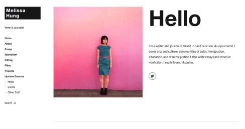
You may wish to check out our list of writing portfolio examples, but here are some other designs to check out for inspiration:
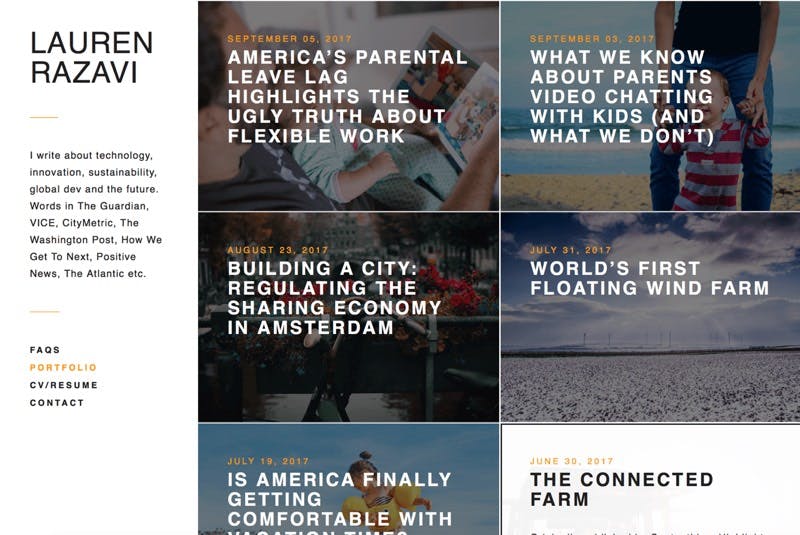
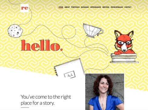
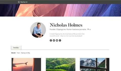
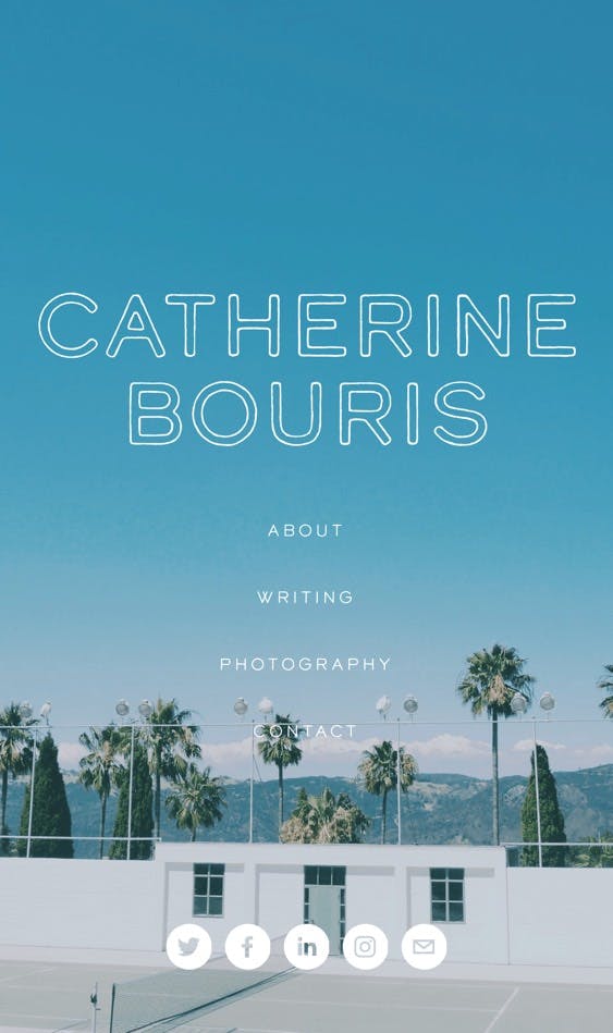
Catherine Bouris' mobile-first portfolio is also worth looking at:
Looking for more great examples of writing portfolios? Check out some of the following pages:
- Writing Portfolio Examples from Clippings.me (portfolios we love made using this site)
- Writing portfolio roundup from Format.com
Step 4
Adding Samples

Now the fun bit begins!
We generally recommend adding between 10-20 pieces of work to an online portfolio - the overall aim here is to give a snapshot of what you can do in an overview that the other person will be able to finish. Don't feel that you have to include everything that you've ever written.
Choose a selection of writing samples that best serves the purpose you identified in section 1. Generally, it's good to use work that shows the versatility of your skills, but this may not be the case for your specific needs.
As Susanna Speier identified in a great Poynter piece on journalism portfolios:
Recruiters and HR departments simply "don't always have the bandwidth" to research a candidate on the Internet, said Lars Schmidt, NPR's senior director for talent acquisition. Schmidt said he prefers journalist portfolios that are categorized. He also advises journalists to organize their portfolios according to the job they're seeking.
Most portfolios we see are a mix of links and PDF uploads, although there's certainly no harm in using more of one than the other. Do remember, if using links, that they have a nasty habit of moving or changing over time, so it's sometimes best to host the files yourself or set a schedule to come back and check that everything's still where it should be. Example writing portfolio sites that can support PDF include Clippings.me and JournoPortfolio.
Based on the formats you identified earlier, you'll want to make sure you've got enough examples to show the versatility of what you do.
Multimedia portfolios can be trickier to make but offer a better overview in the long term - as The Washington Post's Graphics Director Kat Downs Mulder explains in this ItsAllJournalism podcast
You'll want to pay more attention to the order of your written work, though - make sure it's logical. Some people display their clippings by date, some prefer to do it by section type, and either is fine as long as you're consistent.
Emily Ingram had some superb advice on her site (sadly now deleted) on how to build your own Wordpress portfolio (it applies to any portfolio, really):
I think a good rule of thumb is to keep things simple and try to eliminate any extra clicks for users. In other words: If you can put a good amount of your clips all on one page and still make it look simple, do it. Know how annoying it is to go to a newspaper's Web site and have to load an entirely new page for each photo in a 50-photo slideshow? It's the same concept.
If possible, try to include subheadings as well as the article title with each writing sample that you add - just as with a real article, they dramatically increase the chances of someone reading on. And, as already mentioned, if you're able to use pictures, it can make a real difference:

In the case of an author portfolio rather than a journalist one, consider using shorter excerpts rather than full chapters. It can be overwhelming for readers to be faced with dense chapters to navigate so offering the option of something shorter is normally appreciated.
If you're building an academic portfolio, make sure that you're meeting the requirements of whichever institution you're applying to. Critically, make sure that you've chosen a sufficient variety of papers - don't submit one with three or four with a very similar structure. There may also be restrictions on how many papers you can submit from any one course.
Step 5
Biography
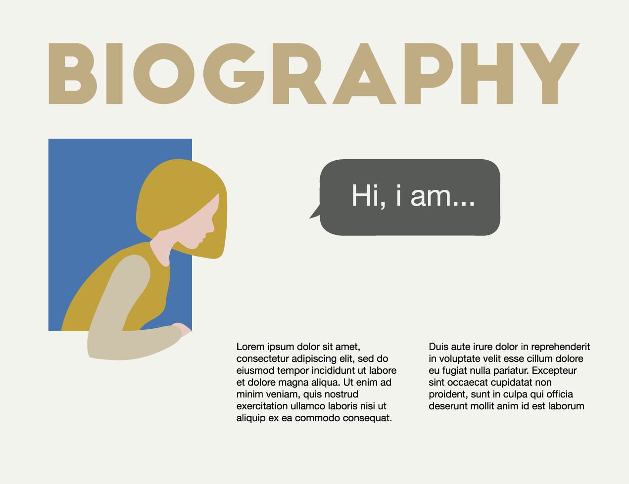
Most writers include a personal overview in their portfolio to provide context. It's up to you to make this as long or as short as you want - I've seen people including a full CV or just a few lines of text to explain who they are.
What to include in your bio? Well, your job title and company are a good place to start. Then, many writers use the bio as a space to do what they do best - tell a story. If you can get some attention by weaving together some bullet points that fulfill your portfolio's objectives (see step 1), that's great. Can you explain some of your best creations or achievements?
For students and graduates, this is a place to mention your college, your major and year, your roles on campus and any other information that will give people a flavor of who you are. But consider - always - that this is a public piece of work and if you're asked about it later, you don't want to squirm.
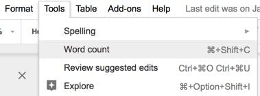
Before attempting this section, it's worth firing up a word processor so you've got an idea of word count. Realistically, 200 words are probably the limit of what you should go for - readers want to get an overview of you in ten seconds or less, so make every word in those first sentences count. No fluff, no buzzwords - just plain-spoken facts about you.
Resume or no resume?
Back again to NPR's Lars Schmidt in the Poynter piece:
He urges journalists to "include a resume and have it up on your portfolio." Yes, a resume. An easy-to-find resume, Schmidt said, is still the best way to say, "here's what I can bring to your organization."
So adding a CV is considered a good idea, but if you choose to do so, make sure it's formatted correctly - often you'll find it looks more professional to embed it within your clips than to paste it in plain text somewhere. If you have a portfolio service where you can include it as a separate document, all the better.
Finally, make sure you've got your contact details. In many great portfolios, this is in the form of a call to action - e.g. "contact me via email at [email protected]", leaving the reader in no doubt as to what to do next.
You'll also want to include social media links so that people can find you on Twitter, LinkedIn, Tumblr and anywhere else you maintain a professional presence. If your Facebook page contains embarrassing pictures, don't link to that - obviously.
What NOT to add
It's best not to include any of the following things in a profile:
-
Your age - nobody wants to see this, especially if it translates to 'young and inexperienced'. If you must put a number, make it about your experience - "I've been a reporter for ten years."
-
Lack of confidence - in general, it rankles when writers write about what they one day "hope" to become. If you haven't got there yet, it's fine, but there's no need to draw attention to that fact. It damages a reader's belief that you'll deliver quality.
-
Grammatical mistakes - obviously. Take a free trial of a tool such as Grammarly to ensure your portfolio is free of errors.
-
Condescension - it's OK if you're great, but if you're that good a wordsmith, you'll be able to tell me that without making me feel like the little guy. The trick is to make your audience feel good about themselves at the same time as showcasing your skill. So no spammy header lines, no passive-aggressive copy and no cockiness. Just be honest, open and proud.
Step 6
Sharing
Make sure your friends and family know all about your portfolio. Share it on Facebook first to ask for feedback (you'll be amazed at what you missed), and then cast the net a little wider on Twitter, Tumblr, LinkedIn and your other social networks.
You need to drive traffic to your portfolio for it to be shared, so it's a good idea to start dropping the link around the place. Put it in your email signature and in the profile pages of your social networks, especially Twitter (if you've got an account!). You may also want to make sure that it's included on your blog and your LinkedIn page (Clippings.me users can embed their clips right into their LinkedIn pages).
There's nothing worse than an out-of-date writing portfolio. We recommend returning to your profile a couple of times a month to check that the links are all working and to add new pieces of work. This is a good thing to do because it allows you to build up a following around your portfolio, and it also shows the evolution of what you do, proving that you're active in the field and a good bet for your target audience!
What are your tips? Let us know by tweeting them @clippingsme and we'll RT the best. Thanks to all the people we've quoted in this piece.
How To Make A Writing Portfolio
Source: https://www.clippings.me/writing-portfolio-how-to
Posted by: schneiderfelist.blogspot.com

0 Response to "How To Make A Writing Portfolio"
Post a Comment