How To Make An App Icon In Photoshop
Design a photorealistic app icon in Photoshop
- Software: Photoshop CS3 or later
- Project time: 3-4 hours
- Skills: Use layer styles and masks, create realistic light and shadow effects
In this tutorial, I'll explain how to use light and shadow to make realistic artwork – in this case, a record player app icon. Using Photoshop's powerful layer styles, I'll show you how to produce impressive results in a short amount of time.
We're also going to use a technique for quickly changing the colour of textures, and I'll share some expert tips that I use in my work for adding realism.
Step 01
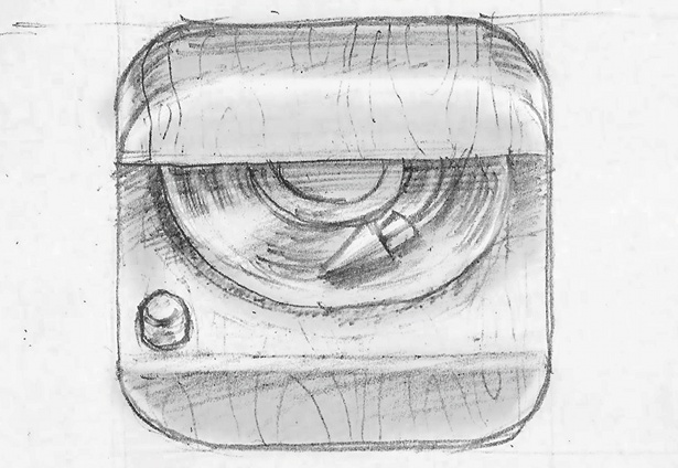
First sketch out your icon idea. I drew the vinyl initially, before adding the rest of the elements, such as the stylus and switch button. I like to make my sketches look 3D but without using perspective, so I added rounded rectangles to make it look like an open box.
Step 02
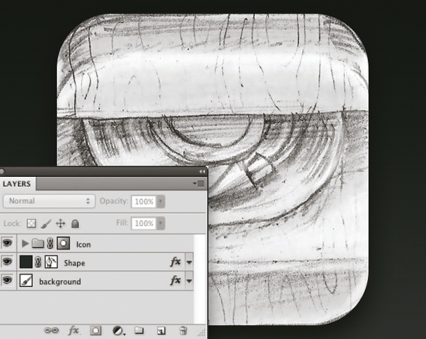
Scan your sketch and import it into Photoshop. Select the Gradient tool and then fill the background from dark to light. Next, draw a 512x512px square using the Rounded Rectangle tool, setting the radius of the corners to 90px. Now hold down Opt/Alt and select the shape, create a new folder called 'Icon' and make a mask for the folder.
Step 03
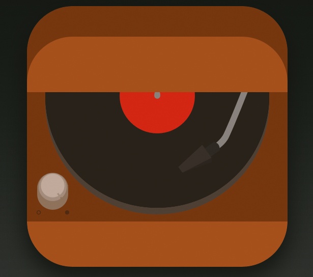
The colour choice for your icon is very important. Avoid absolute colours to make the icon more realistic. For the vinyl I used dark brown instead of black, and for the switch button I used light brown instead of grey.
Step 04
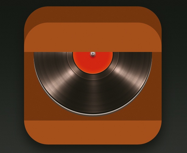
Using the Layer Style options we can add some interesting effects. For the vinyl record, I added a Radial Gradient Overlay with the blend mode set to Color Dodge, and to make the lines I added a noise gradient. Duplicate the layer and change the gradient type to Solid to create the impression of light reflecting from the record.
Step 05

Now create some areas of shadow using the Color or Linear Burn blend modes, followed by some areas of light with Color or Linear Dodge. This will make the light and shadow effects more convincing. For the stylus and the switch button, I added a drop shadow and used it as reflection of the light.
Step 06
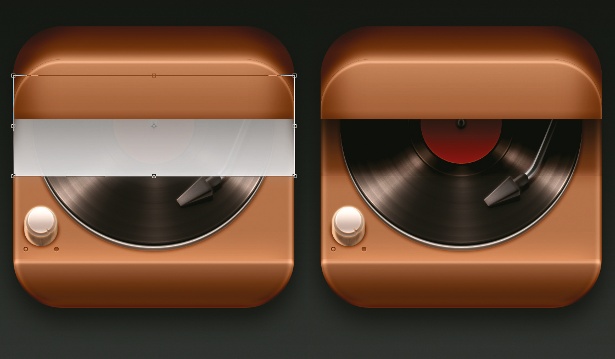
For a more realistic shadow, place a grey rectangle on top of the vinyl, add an Outer Glow with the same colour and change the blend mode to Linear Burn. I used a 50% tint of a grey colour and then played around with the opacity until I achieved the desired effect.
Step 07
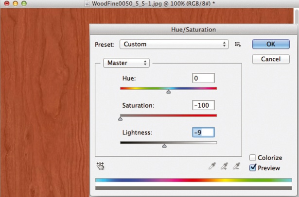
Textures are also very important for adding realism. You can either use your own or find some on a stock website. For this project, I used a wood texture: I saturated it and applied some levels. I then created a clipping mask on the layer and changed the blend mode to Overlay.
Step 08
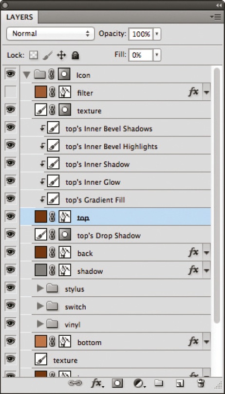
When you're happy with all the layer style options, make a copy of the folder. At this point, separate some of the styles (Layer> Layer Style> Create Layer) so that you can control them with masks.
Step 09
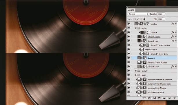
You can now duplicate or erase some of the layer styles – play around for the desired effect. Some parts of my icon were too light or too dark, so I selected the layer effect, masked it and deleted parts of the layer with a brush.
Step 10
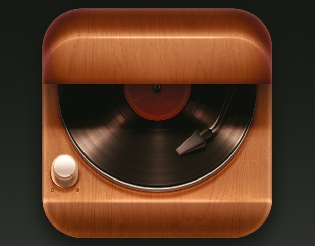
Create a new layer, place it at the top of the stack, and add Inner Glow and Satin effects. With Satin, I used the same overlay colour, making the entire icon the same tone. You now have a realistic looking app icon.
Liked this? Read these!
- Adobe Photoshop CS6 hands-on review
- Free Photoshop brushes every creative must have
- Free Photoshop actions to create stunning effects
- The best Photoshop plugins
- Download free textures: high resolution and ready to use now
Related articles
How To Make An App Icon In Photoshop
Source: https://www.creativebloq.com/app-design/design-photorealistic-app-icon-photoshop-5132677
Posted by: schneiderfelist.blogspot.com

0 Response to "How To Make An App Icon In Photoshop"
Post a Comment